
Data Visualizations - THE fun way to show information.
That’s showbiz baby
Adobe Illustrator
Anyone who knows me knows that I’m constantly on the move and doing something. Wanting to see exactly how I spend my week, I tracked my every move for a total of a week based on ten categories, differentiating things within each category.

Data visualizations allow for a unique way to show extensive amounts of information separate from your typical infographics or pie charts. These data visualizations I created based on trying to get an insight into how I move and operate through life.
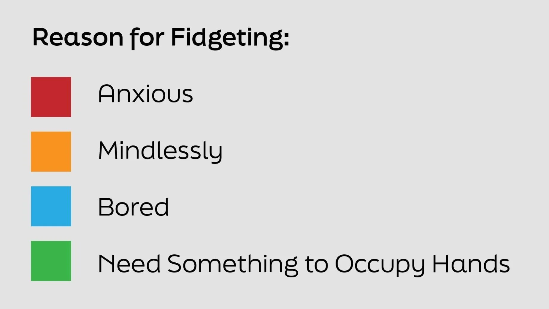
FIDGET FIDGET FIDGET FIDGET
Adobe Illustrator
I’ve always been one to fidget with my stuff—necklaces, earrings, hoodie strings, rings, anything I can get my hands on. I often wondered how much I actually do fidget, what I fidget with most, and the reasonings behind it. This data visualization is a log of just that. Anytime I caught myself fidgeting, I marked down when it was, what I was fidgeting with and why I was fidgeting.


OH, THE PLACES I GO!
Adobe Illustrator
Even though I love driving around, I felt like I was spending an abnormal amount of time in my car driving, so I decided to track my driving habits over the course of a week. I noted down where I was going, how long it took me to get there, how far away my destination was, if I was listening to music, if I was the one driving, and if I was in the car alone or with someone.
Does Caffeine really work?
Adobe After Effects
If you ever see me without caffeine in my hand, just know I’m on my way to get some. I had felt like caffeine wasn’t working as well as it normally was, so I decided to track my energy levels after I consume caffeine, and whether I felt more or less energized, or if I felt neutral.